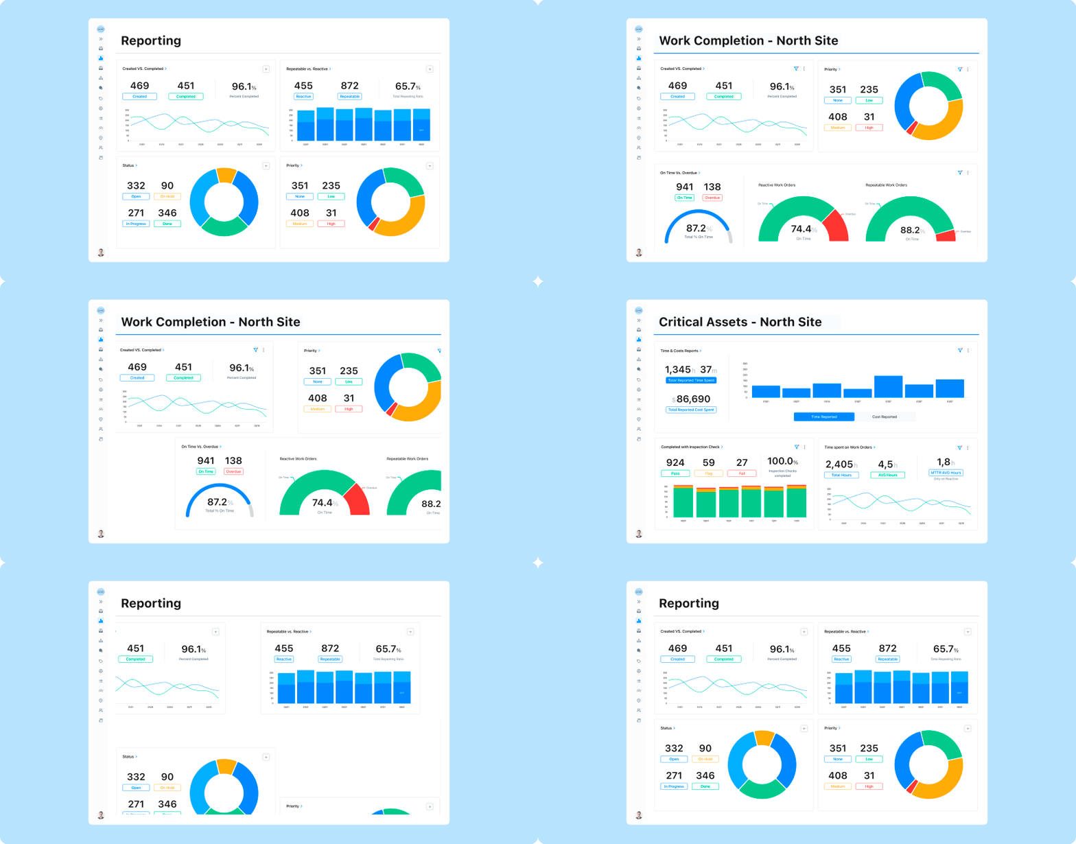
In today’s economic climate, optimizing costs and driving efficiencies are more important than ever. Budget squeezes and supply chain delays make it critical to run leaner. To help solve these challenges, we’ve unleashed enhanced Reporting tools to make data-driven decisions via MaintainX.
We know that working with data isn’t easy.
Many maintenance managers spend hours every week wrestling with static spreadsheets or clunky maintenance and ERP software. And they still struggle to get the answers they need to increase PM effectiveness, on-time work completion, and equipment uptime.
We’ve spent the last few months working closely with our customers to help them extract real-time actionable insights from MaintainX within seconds.

Create Custom Reporting Dashboards
Data at your disposal is only as good as what you can do with it. Data needs to be actionable and easy to work with. When it’s not, your data becomes one of the most underutilized resources in your toolkit.
In MaintainX, you can now create Custom Dashboards to quickly monitor and report on the performance metrics that matter most to you and your team.
Custom Dashboards enable you to:
- Save time on administrative reporting with instant visibility into critical metrics.
- Quickly highlight areas to improve by comparing performance across teams, locations, equipment, time periods, and more on a single screen.
- Drive operational excellence with comparative insights to inform budget and planning decisions.
Access Advanced Analytics
And, to help you get as much value as possible from these custom dashboards, we’ve unlocked extra functionality on our Premium and Essential plans.
Premium members now have unlimited access to Advanced Analytics. This lifts the six-month date range limit when filtering, allowing you to create year-on-year reports and monitor long-term trends.
In addition, for those on the Essential plan, we’ve activated filters in your Reporting module so that you can build powerful comparative reports into your dashboards.

Access the Insights that Matter Most Faster
Custom Dashboards allow you to curate collections of charts revealing the actionable insights most important to you. You can filter each graph individually to make comparisons on a single screen to tell the specific stories visible through your data.
Advanced analytics and filters are particularly powerful for spotting trends across complex, distributed operations. People who manage multiple teams, locations, or assets can quickly compare performance metrics across these different dimensions or create laser-focused dashboards on one specific subject.
Examples of how Custom Dashboards can help increase uptime, team efficiency, and compliance include the following:
- Identify the team with the lowest PM compliance rate. Spotting where tasks are skipped helps you uncover issues with the work order process, spare parts inventory, or a shortage of available labor on a team.
- Discover which of your critical assets costs you the most. Filter and compare data side-by-side on the cost, duration, and type of work performed on your most critical assets to help you pinpoint where your resources are going.
- Learn which locations experience the most safety incidents of a certain type. Build a dashboard using Work Order categories to see how many “near misses” you’ve had in the past quarter across each of your buildings.
To make your dashboards more relevant to others, you can now add titles and descriptions and even rename each graph on the dashboard to put data in terms your stakeholders will understand. These customizations will help you communicate more effectively with your team and make business cases to stakeholders.

Drive Continuous Improvement by Analyzing Work Performance Trends
Lifting the 6-month date range limit for Premium members, and activating Reporting filters on the Essential plan, brings more power to your Reporting module.
On Premium, you can now create year-end reports and dashboards showing the progress of your department over the past 12 months or more. You’ll be able to reveal seasonal trends and get more context to build your budget strategy for the following year. You can now dive deeper into the history of your critical assets, identifying the types of issues on the rise and where you can expect costs to increase in the future.
To make these data-driven insights more widely accessible, we’ve also lifted the restrictions on Reporting filters on the Essential plan.
Explore the Power of Enhanced Reporting
MaintainX customers already use Reporting daily to find opportunities to improve the efficiency, safety, and productivity of their teams. We’ve created these tools to make your data even more accessible and actionable.
To get a closer look at the insights you can discover with Custom Dashboards, book a demo today.
FAQs

Colin Strachan is a Senior Product Marketing Manager at MaintainX, with a background in journalism and almost a decade of experience in SaaS marketing. In the past few years, he has worked with some of the world’s largest enterprises to adopt software that empowers their employees to work more effectively.

.png)
.png)

.png)


.jpeg)

.jpeg)
.png)
.jpeg)
%2520(1).png)


.jpeg)
