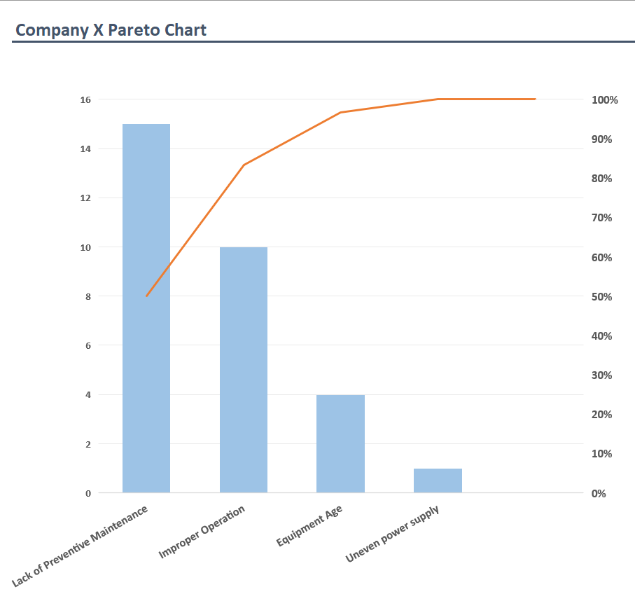
A Pareto chart is an analytics tool that helps identify the most significant causes of failures. It’s based on the Pareto principle coined by the Italian economist Vilfredo Pareto in 1906. The Pareto principle, later popularized by Joseph Juran as the 80-20 rule, was based on the observation that 20% of the country’s population holds 80% of its wealth.
You can apply the same principle to various use cases, like root cause analysis and quality control. For example, a manufacturer can apply the Pareto principle to understand the 20% of potential causes that result in 80% of equipment failures.
Below, we explain how to use a Pareto chart to analyze machine failures and their causes.
What Is a Pareto Chart?
A Pareto chart is a bar graph with causes of failure listed on the X-axis and the frequency of those causes on the Y-axis.
However, Pareto charts differ from bar charts because, like histograms, they require ordering the bars from the highest to lowest. The bar for the cause with the highest frequency of occurrence is shown on the left side, while the shortest bar is on the right side.
The Pareto chart also includes a line graph showing the cumulative percentage along the right vertical axis. The cumulative percentage is calculated as the sum of a specific cause’s percent against the total of all causes.
Generally, a Pareto chart will help you see that a few factors result in the majority of faults or failures. Once you identify the causes of the highest number of faults or failures, you can eliminate them and minimize equipment downtime.
Pareto Principle:
“The observation that, although there are often many causes for any observed phenomenon, it is often the case that a small subset of those causes is responsible for most of the observation.”
Investopedia
Pareto Chart Example
Creating a Pareto chart involves compiling and organizing data on repair history in a chart. So, first, you need to calculate individual and cumulative frequencies. Below is an example of how to create a Pareto chart, from compiling the data to creating the chart.
Company X identifies four causes of equipment failure and wants to compare these problems via a Pareto chart.
The company names the following causes and their frequency over the previous year:
- Lack of preventive maintenance: 15
- Improper operation: 10
- Equipment age: 4
- Over maintenance: 1
Here’s how Company X prepares the Pareto chart using this data:
- Label the vertical axis with frequency and list the items along the horizontal axis, starting with the item with the highest frequency.
- Plot the bars as per the data set.
- Calculate the frequency percentage for the data. In this example, the frequency as a percent would be as follows (cumulative frequency in parenthesis):
The total of the four causes occurring last year equals 30 (15+10+4+1) So, take the total number of occurrences of each cause and divide it by 30:
- Lack of preventive maintenance: 15/30 = 50% (50%)
- Improproper operation: 10/30 = 33.3% (83.3%)
- Equipment age: 4/30 = 13.3% (96.6%)
- Uneven power supply: 1/30 = 3.33% (99.99%)
- Label the cumulative percent along the right horizontal axis.
- Plot the line graph as per the cumulative frequency calculated in the previous step. The line graph starts at the origin, and the first point in the line graph lies at the top of the first bar.

Note that this example uses the frequency of each cause. Therefore, eliminating the most frequent causes (referred to as the “vital few”) should significantly reduce equipment downtime.
However, if you want to eliminate causes that cost you the most money, modify the data set accordingly. You’ll need to multiply the frequency of each cause by the average cost of repairs or maintenance. The rest of the process remains the same.
Using Pareto Charts
Here’s what you should know before you use Pareto charts. Pareto charts:
- Focus on past data: Pareto charts rely on historical data. While past data can provide valuable insights, it doesn’t guarantee relevance in the future. When interpreting Pareto charts, make sure you factor in the probability of a specific cause reoccurring in the future.
- Show only qualitative data: Pareto charts only show qualitative data. Therefore, they can’t be used to calculate data variance, standard deviation, or mean.
- Depend on the accuracy of your data: You’ll need equipment repair history to identify the causes of asset failure and their frequency. The best way to compile and manage this data is to use a computerized maintenance management system (CMMS).

CMMS Helps with Pareto Analysis
Traditional manufacturers relied on Microsoft Excel to save and organize data. However, manually managing maintenance and repair data on a spreadsheet is a hassle you can avoid by using a CMMS. A CMMS like MaintainX automatically logs maintenance and repair history, tracks time and cost, and unplanned downtime.
A CMMS also helps streamline maintenance processes. For example, you can assign work orders, create checklists, and allow technicians to collaborate via the built-in chat option. When needed, technicians can upload a picture of the asset, allowing technicians to communicate more contextually.
If that sounds interesting, try MaintainX today!
FAQs

Caroline Eisner is a writer and editor with experience across the profit and nonprofit sectors, government, education, and financial organizations. She has held leadership positions in K16 institutions and has led large-scale digital projects, interactive websites, and a business writing consultancy.


.jpg)


